
新CMS完全対応マニュアル
目次
ボタン(component)のカスタマイズに関する規則
ボタン(component)のカスタマイズをする際に遵守すべき命名規則とコーディングルールについてまとめています。
ボタン(component)のパーツ配置についてはこちらのページをご確認ください
1. ボタン(component)の命名規則
ボタンに独自クラスを付与する場合、「btn_custom●●」と命名してください。●●部分は数字で、01から始まる連番となります。
旧CMSにおいては、ボタンには上記クラスの付与が必須です。
なお、「btn_custom●●」へのオプションクラスとして使うクラスには特に決まりはありません。
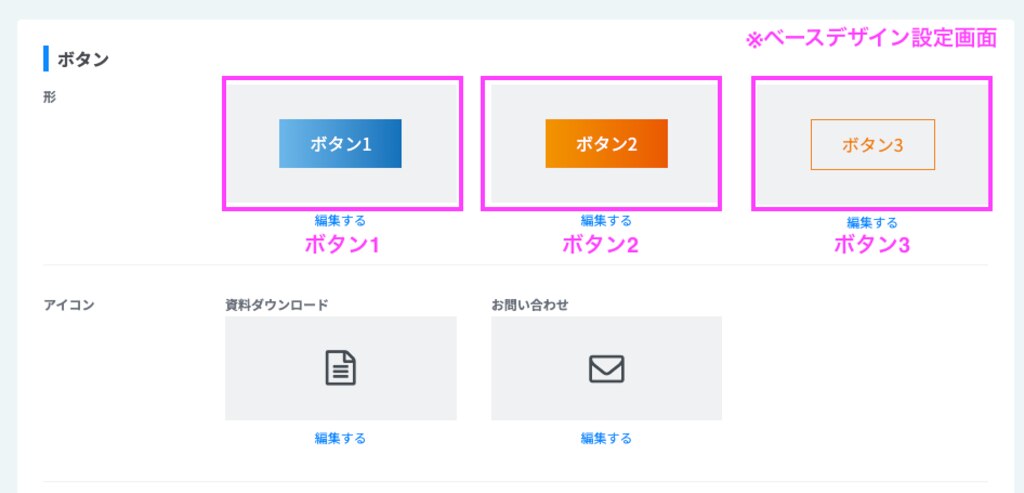
下記表内の各ボタンについては、本ページ内の説明をご確認ください。
旧CMSにおいては、ボタンには上記クラスの付与が必須です。
なお、「btn_custom●●」へのオプションクラスとして使うクラスには特に決まりはありません。
下記表内の各ボタンについては、本ページ内の説明をご確認ください。
| 命名規則 | |
|---|---|
| ボタン (新旧CMS共通) ※旧CMSでは必須クラス |
btn_custom01 btn_custom02 … |
| ボタン (新CMSデザインパーツ流用時) |
btn1_custom01 btn1_custom02 … |
|
TELボタン
(新旧CMS共通)
※旧CMSでは必須クラス |
btn_custom_tel |
|
ボタン(ナビ用)
→新CMS専用のパーツ |
btn_navi_custom01 btn_navi_custom02… |
注意事項
新CMSにおいては独自クラスなしで調整を行えるケースもあります。
詳細は本ページ内の「3. 新CMSでのカスタマイズについて」をご確認ください。
2. 新CMSではどのような場合にCSSで調整を行う?
新CMSでは、ボタンは基本的にベースデザイン設定でフォントサイズやボタンカラーを設定していくことが前提となります。
しかし、以下に書かれている箇所はベースデザイン設定で変更を加えることができませんので、CSSで調整していくことになります。
しかし、以下に書かれている箇所はベースデザイン設定で変更を加えることができませんので、CSSで調整していくことになります。
CSSで対応する調整
- デフォルトで設定されているボタン上の余白(margin-top)
- ボタン内の余白(paddingで大きさの調整が必要な場合)
- 指定されたアイコンがベースデザイン設定で選択できないものの場合
- 背景色がボタン1 〜 3のいずれにも該当せず、異ったスタイルが必要となる場合
- デフォルトで施されているbox-shadowを調整(または削除)する場合
3. 新CMSでのカスタマイズについて
3.1 - 独自クラスなしで調整を行えるケース
(デザインパーツ自体を調整)
以下の条件に該当する場合はクラスを付与せずCSSでデザインパーツに直接調整を行います。
- デフォルトで設定されているボタン上の余白(margin-top)を調整する場合
- ボタン内のpaddingを調整する場合
- デフォルトで施されているbox-shadowを外す場合
- デフォルトで施されているbox-shadowの数値を変更する場合
(以下はその調整を行っている書き方の一例です)
//デザインパーツ
.component {
&:not(:root:root:root:root:root) {
//ボタン全体(例:自由にカスタマイズしてください)
// &.button[data-designpart-id] {
// margin-top: 0;
// .button-cont {
// a {
// &.size-s {}
// &.size-m {}
// &.size-l {}
// &:is(.size-s,.size-m,.size-l) {
// box-shadow: none;
// }
// }
// }
// }
&.button {
&.btn1_custom01 {
.button-cont {
a {
&:is(.size-s,.size-m,.size-l) {
&::before {}
}
&:is(.blue,.red,.orange,.black,.white) {}
&:hover {}
}
}
}
}
〜
}
注意事項
上記の条件を超える変更が必要な場合は、デザインパーツに対して直接調整を行わないでください。
必ず独自クラスを付与し、その中にスタイルを記述する形とします。
必ず独自クラスを付与し、その中にスタイルを記述する形とします。
3.2 - ボタンをカスタムするケース
(デザインパーツのデザインを流用)
デザインパーツを使用するボタンのカスタムはベースデザイン設定で作成したボタンのスタイルを流用する形で行います。
デザインパーツに対してクラスを付与し、スタイルを追記していきます。
デザインパーツに対してクラスを付与し、スタイルを追記していきます。
&.button {
&.btn1_custom01 {
.button-cont {
a {
&:is(.size-s,.size-m,.size-l) {
&::before {}
}
&:is(.blue,.red,.orange,.black,.white) {}
&:hover {}
}
}
}
}
命名規則
この場合、クラス名はどのボタンを流用しているかがわかるよう、「btn」の後に使用しているボタンの番号を入れます。
- 「btn1_custom01」「 … 02」〜 :ボタン1にスタイルを当てる場合
- 「btn2_custom01」「 … 02」〜 :ボタン2にスタイルを当てる場合
- 「btn3_custom01」「 … 02」〜 :ボタン3にスタイルを当てる場合
ベースデザイン設定で作成したボタンを流用するケース
ボタンの大きさやフォントサイズが同じで、一部(例:アイコンのみ変えたい場合 など)に変更を加えたい場合、ベースデザイン設定で作成したボタンのスタイルを流用することができます。
また、現状あるボタンの色違いを作成したい場合や、同じ形状で4種類目以降のボタンを作成したい場合もボタン1 - 3をベースにしているため、このケースに当てはまります。
また、現状あるボタンの色違いを作成したい場合や、同じ形状で4種類目以降のボタンを作成したい場合もボタン1 - 3をベースにしているため、このケースに当てはまります。
3.3 - 「ボタン(ナビ用)」をカスタムするケース
「ボタン(ナビ用)」は、タブレット幅(834px)からアイコン化するため、
判断がつきやすいように「btn_navi_custom01」といったナビ専用のクラスを付けます。
判断がつきやすいように「btn_navi_custom01」といったナビ専用のクラスを付けます。
&.button {
&.btn_navi_custom01 {
.button-cont {
a {
&:is(.size-s,.size-m,.size-l) {
&::before {}
}
&:is(.blue,.red,.orange,.black,.white) {}
&:hover {}
}
}
}
}
3.4 - 新しくボタンを作成するケース(デフォルトパーツを使用)
ボタンの形状(大きさやフォントサイズ)が何もかも異なっており、上記の方法で対応出来ない場合は、
CSSを流用せずにデフォルトパーツに最初からスタイルを記述し、ボタンを作成することができます。
(例)テキストに下線が装飾されたシンプルなボタンを作成する必要がある場合、形状が異なるのでデフォルトパーツを使用し、最初から作成します。
CSSを流用せずにデフォルトパーツに最初からスタイルを記述し、ボタンを作成することができます。
(例)テキストに下線が装飾されたシンプルなボタンを作成する必要がある場合、形状が異なるのでデフォルトパーツを使用し、最初から作成します。
3.5 - 記述場所に関するルール(デザイン・デフォルトパーツ)
新CMSでは、ボタンに対してスタイルを記述する場合は、基本的に"サイズ"内に書いてください。
ただし、色に関することのみ"カラー"にスタイルを当てるようにしてください。
編集画面の崩れが発生する可能性があるため、aタグ直下にはスタイルを記述しないでください。
ただし、色に関することのみ"カラー"にスタイルを当てるようにしてください。
編集画面の崩れが発生する可能性があるため、aタグ直下にはスタイルを記述しないでください。
&.button {
&.btn1_custom01 {
.button-cont {
a {
&:is(.size-s,.size-m,.size-l) {
//基本的にここに記述を行う↓
&::before {}
}
&:is(.blue,.red,.orange,.black,.white) {
//色に関する記述のみにここに行う↓
}
&:hover {}
}
}
}
}
注意事項
予期せぬ崩れや、編集画面での操作時に影響が出る可能性があるため、aタグの中に直接や、カラーの中に色以外のスタイルを記述することは禁止されています。
4. 旧CMSでのカスタマイズについて
通常のボタンの記述
「button(ボタン)」>「カスタムボタンサンプル集」内に記述を行います。
「サイズボタン設定」の中でサイズS/M/Lそれぞれについてmin-widthやpadding、font-sizeなどの指定を記述し、大きさを規定します。
その他の各ボタンのデザインに関する記述は、その下の「カスタムボタン設定」の中で各ボタンに対して行います(例:1つ目のボタンであれば「ボタンバリエ01」の中)
旧CMSでは、色の中にスタイルの記述を行います。(以下はその一例です)
編集画面の崩れが発生する可能性があるため、aタグ直下にはスタイルを記述しないでください。
「サイズボタン設定」の中でサイズS/M/Lそれぞれについてmin-widthやpadding、font-sizeなどの指定を記述し、大きさを規定します。
その他の各ボタンのデザインに関する記述は、その下の「カスタムボタン設定」の中で各ボタンに対して行います(例:1つ目のボタンであれば「ボタンバリエ01」の中)
旧CMSでは、色の中にスタイルの記述を行います。(以下はその一例です)
編集画面の崩れが発生する可能性があるため、aタグ直下にはスタイルを記述しないでください。
/*--- カスタムボタンサンプル集 ---*/
.component {
&.button {
&:where(
.btn_custom01,
.btn_custom02,
.btn_custom03
) {
//サイズボタン設定
.button-cont {
a {
〜 中略 〜
//サイズ小のとき
&.size-s {
//ここにサイズSの時の記述
}
//サイズ中のとき
&.size-m {
//ここにサイズMの時の記述
}
//サイズ大のとき
&.size-l {
//ここにサイズLの時の記述
}
&:hover {
opacity: 1;
}
}
}
〜 中略 〜
}
/*-- カスタムボタン設定 --*/
//ボタンバリエ01
&.btn_custom01 {
.button-cont {
a {
&:is(.blue,.red,.orange,.black,.white) {
//ここにサイズ以外のデザインに関する記述
… 以下省略
注意事項
予期せぬ崩れや、編集画面での操作時に影響が出る可能性があるため、aタグの中に直接スタイルを記述することは禁止されています。
TELボタンの記述
「button(ボタン)」>「TELボタン」内にフォントサイズを設定します。
//TELボタン
&.button[data-designpart-id="642f669ce4dc09621d945abc"] {
.button-cont {
a {
//サイズ小
&.size-s {
font-size: calc(4px + var(--fo-button-small-font-size));
}
//サイズ中
&.size-m {
font-size: calc(4px + var(--fo-button-medium-font-size));
}
//サイズ大
&.size-l {
font-size: calc(10px + var(--fo-button-large-font-size));
}
}
}
}
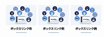
5. ボックスリンクについて
リンクの設定をしている行(row)やカラム(col)のことを「ボックスリンク」と呼びます。
各カスタマイズパレットの一番下に「リンクの設定をする」という表記がありますので、そこからボタンと同様にリンク設定が可能です。
※以前はボタンパーツに専用のクラスを付与してボックスリンクを作成していましたが、現在ではこの方法ではなく、前述の方法で作成します。
各カスタマイズパレットの一番下に「リンクの設定をする」という表記がありますので、そこからボタンと同様にリンク設定が可能です。
※以前はボタンパーツに専用のクラスを付与してボックスリンクを作成していましたが、現在ではこの方法ではなく、前述の方法で作成します。
(旧)ボックスリンクについて
ボタンパーツとカラム(col)に専用のクラスを付与して作成するボックスリンクは今現在使用していませんが、アカウントによってはCSSの記述に残っている場合があります。
ただし、そのクラス付与での作成はせず、カスタマイズパレットのリンク設定での方法で作成お願いします。
ボタンパーツとカラム(col)に専用のクラスを付与して作成するボックスリンクは、現在使用していません。
ただし、アカウントによってはCSSにそのクラスが残っている場合があります。今後は、そのクラスを使用しての作成はせず、カスタマイズパレットの「リンクの設定」で作成をお願いします。
ただし、そのクラス付与での作成はせず、カスタマイズパレットのリンク設定での方法で作成お願いします。
ボタンパーツとカラム(col)に専用のクラスを付与して作成するボックスリンクは、現在使用していません。
ただし、アカウントによってはCSSにそのクラスが残っている場合があります。今後は、そのクラスを使用しての作成はせず、カスタマイズパレットの「リンクの設定」で作成をお願いします。
- カラム(col)のクラス:「box_link_col」
- ボタンのクラス:「btn_custom_boxlink」

© Basic Inc. All Rights Reserved.